01
Problem
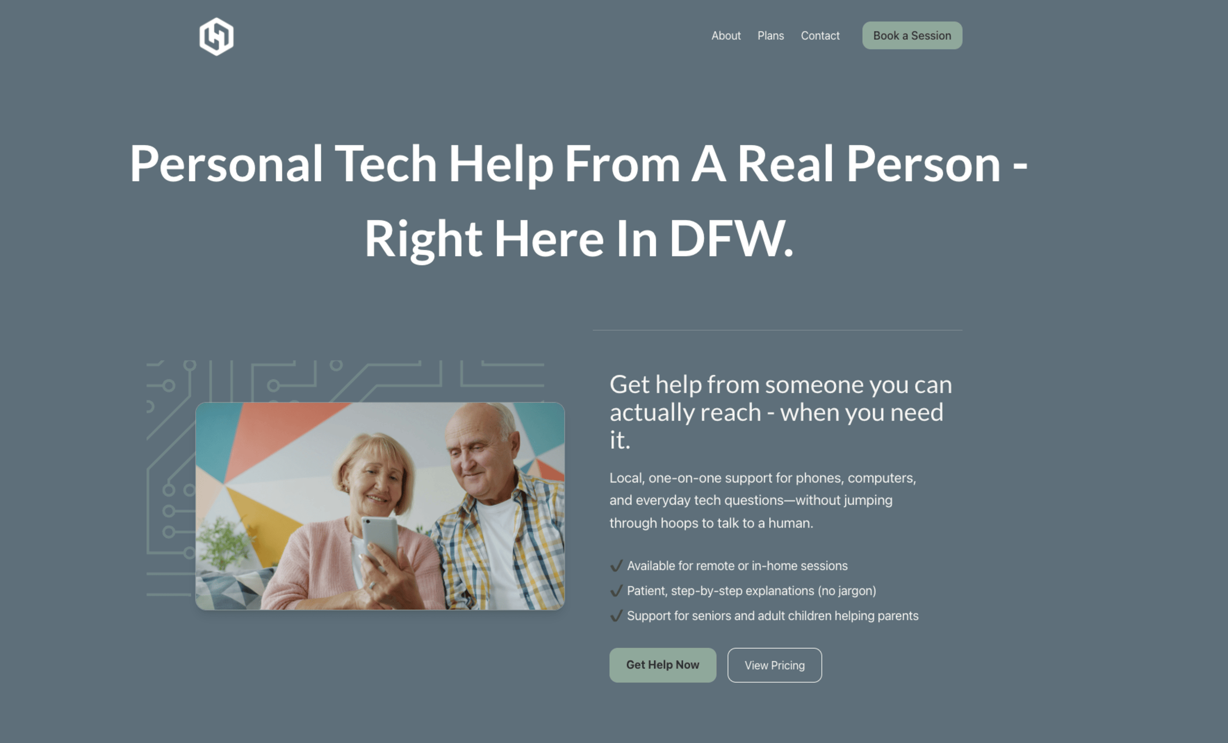
Seniors face anxiety, complexity, and safety risks as essential services become digital-first.
02
Insight
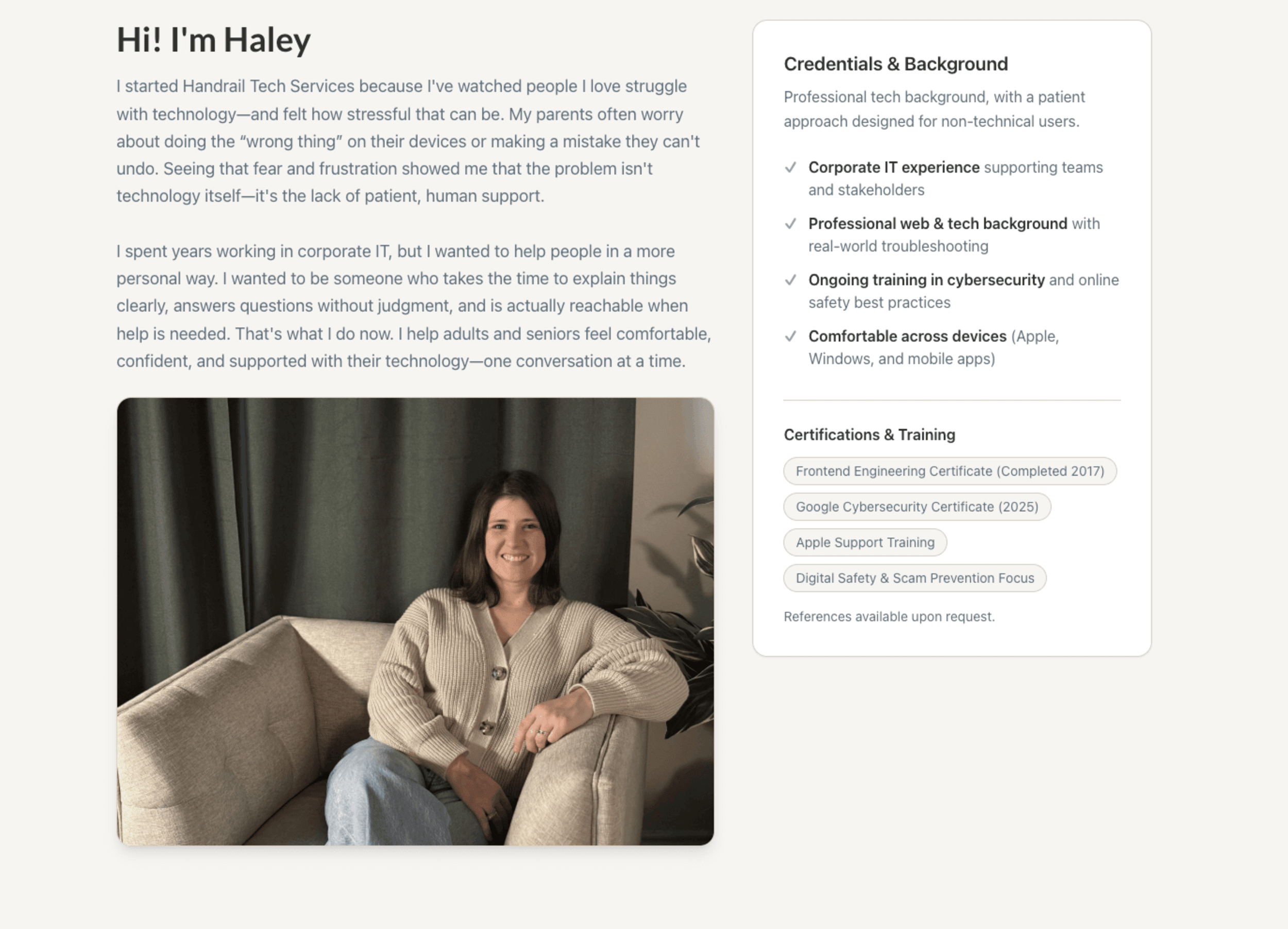
Emotional safety is a UX requirement — trust and clarity are the product.
03
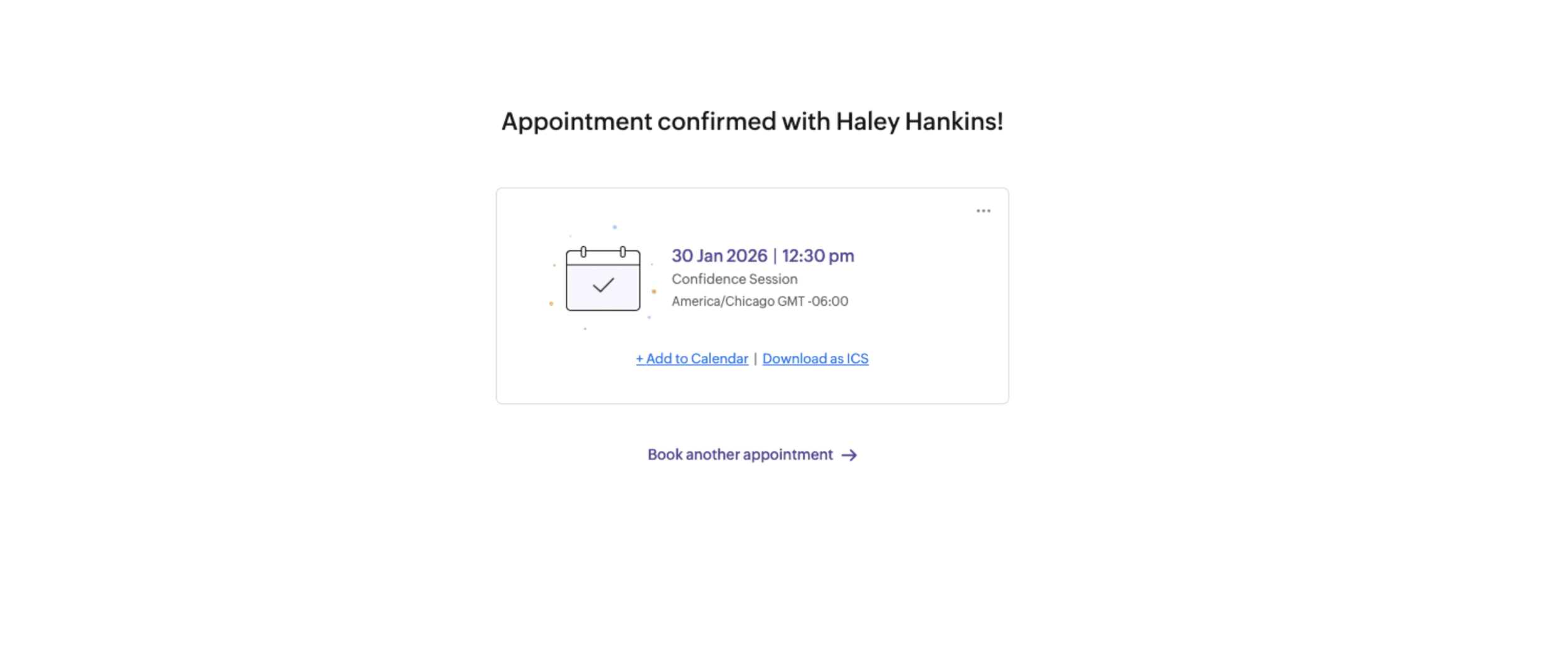
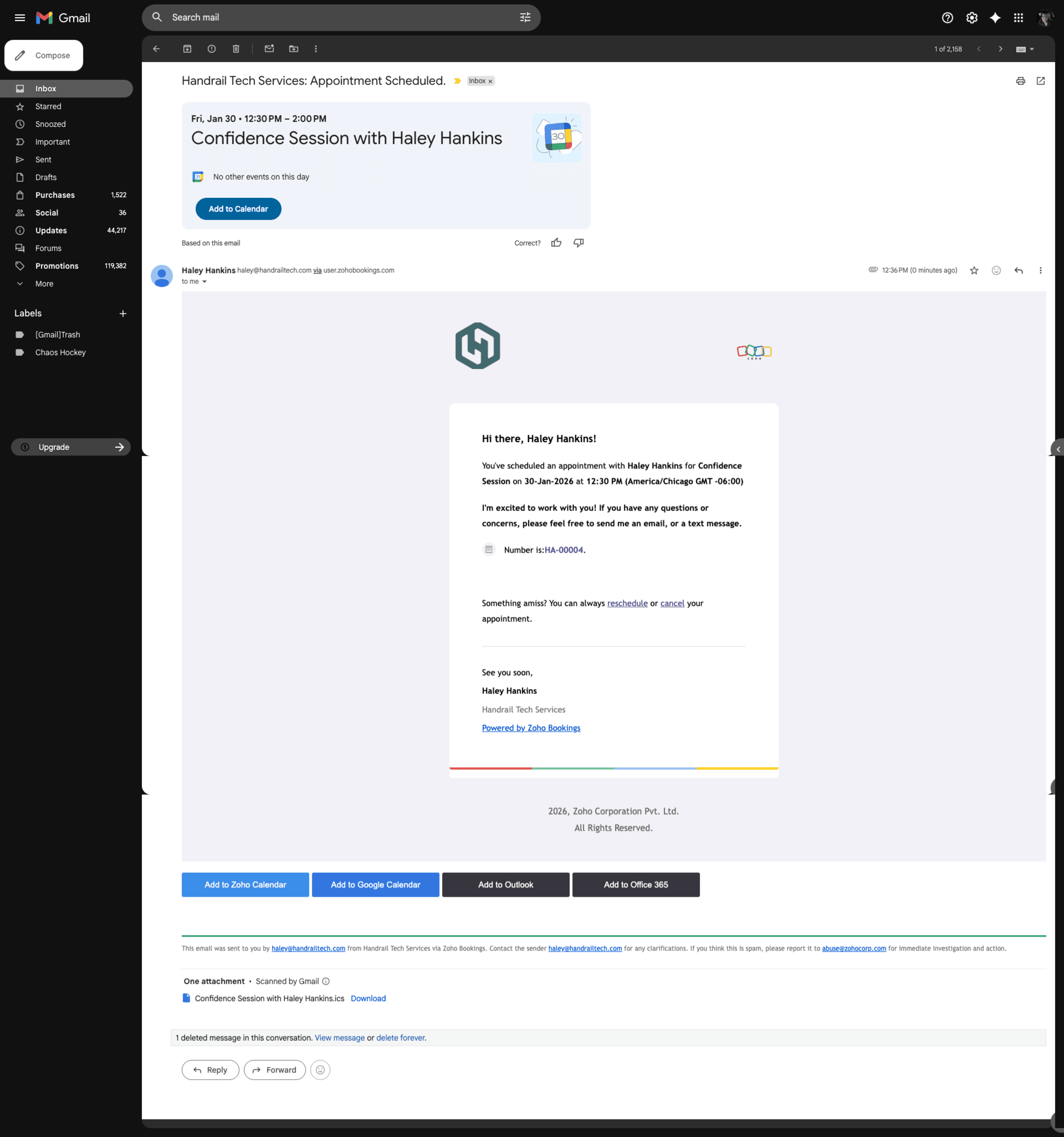
Outcome
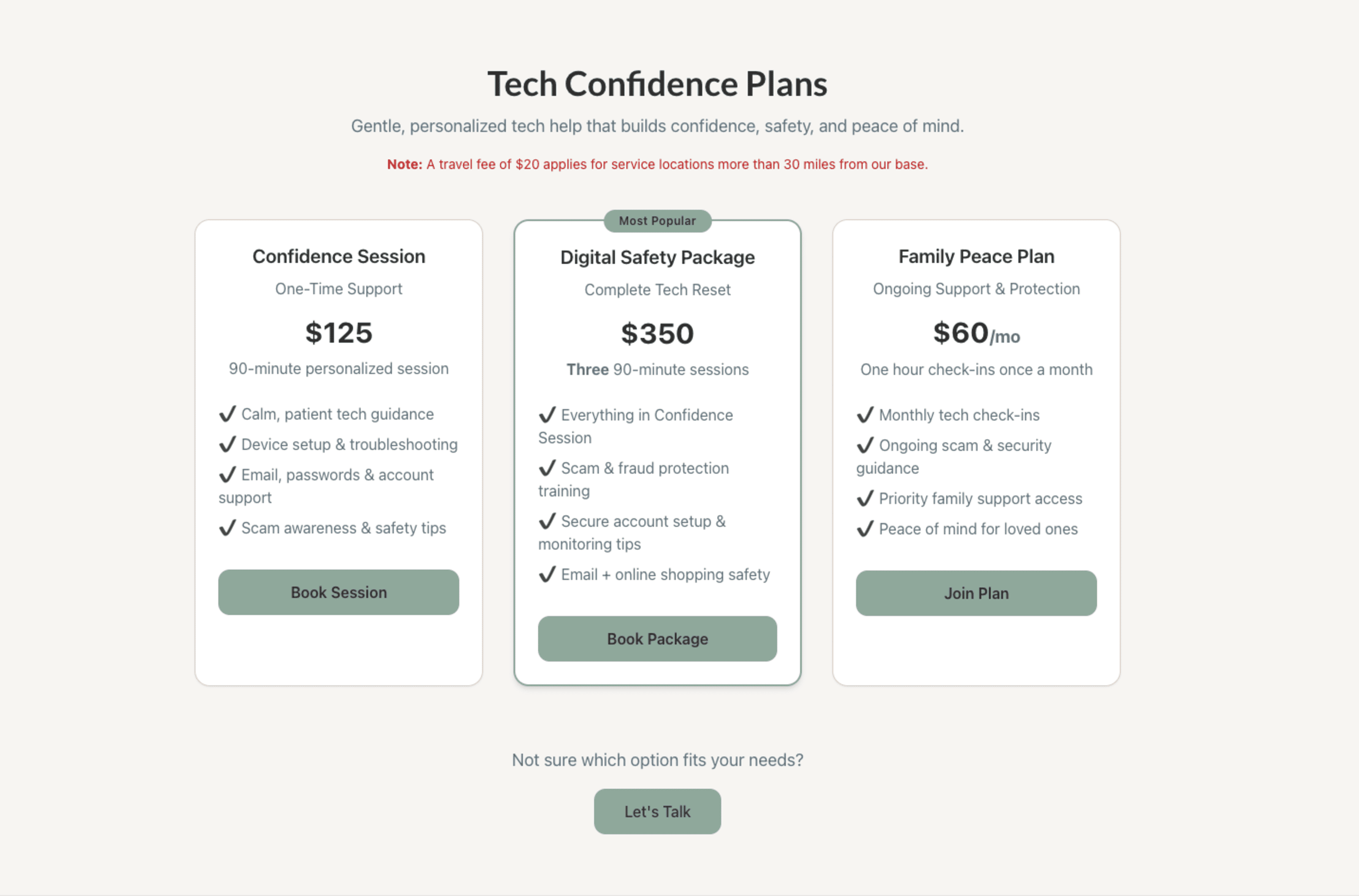
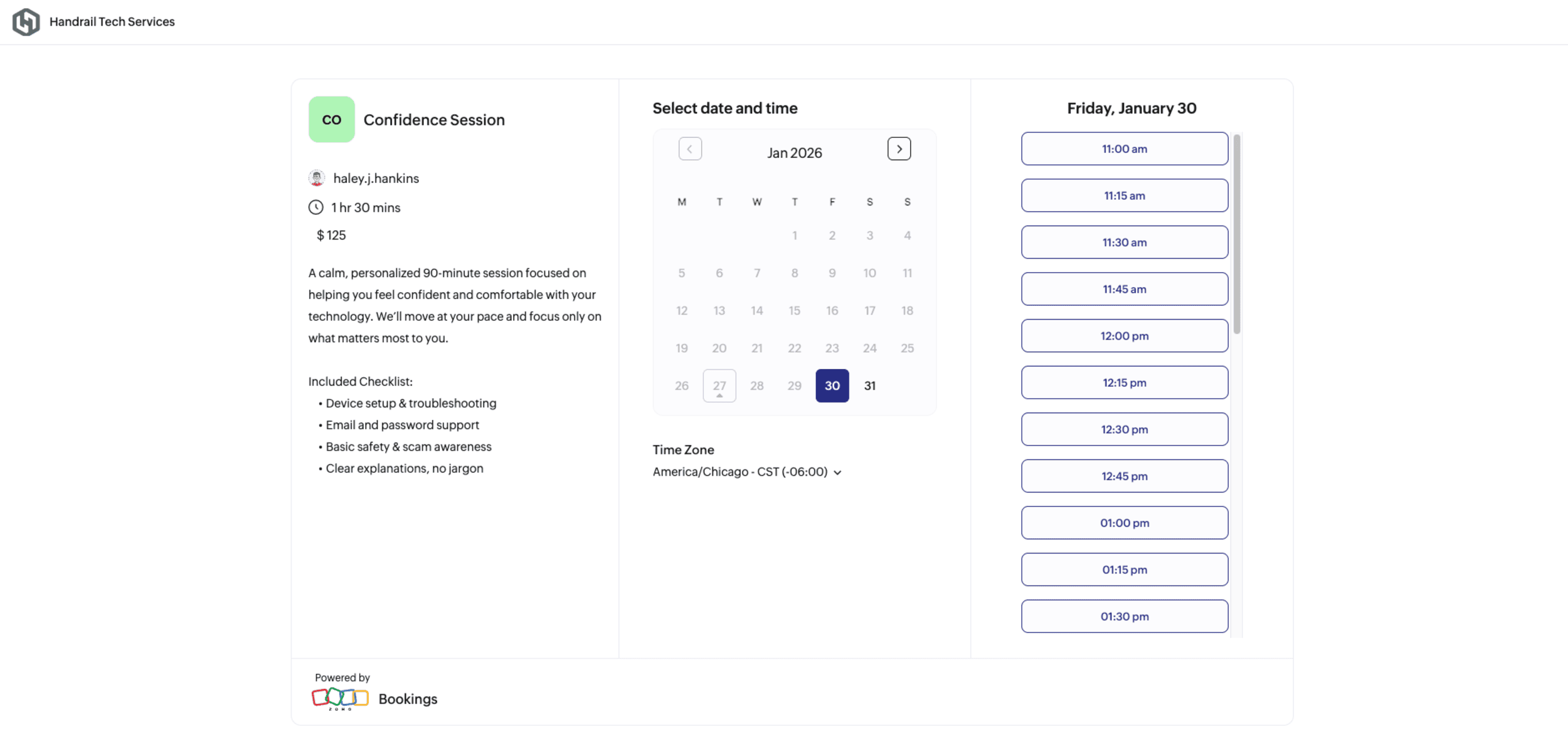
A service ecosystem spanning website, plans, Zoho booking flow, and follow-up support.